


Projects Category: Standard
- Home
- Standard
The Situation:
E-commerce KPI Analysis is a collection of data related to its sales across multiple countries around the world. It encompasses various attributes, such as orders, sales, products, market, etc. Our goal is to transform their raw data into meaningful insights and recommendations for management. More specifically, we need to:
- Track KPIs (orders, sales, profit, quantity, profit margin)
- Compare regional and state-level performance
- Identify product effectiveness and customer behavior
The Data:
We’ve been given a collection of raw data (CSV files), which contains information about orders, quantity, sales, discount, products, categories, customers, segments, regions, markets and others, in a total of a single table, from the years 2020-23.
The Task:
We are tasked with using solely Microsoft Power BI to:
- Connect and transform/shape the data in Power BI’s back-end using Power Query
- Build a relational data model, linking the 2 fact and dimension tables
- Create calculated columns and measures with DAX
- Design a multi-page interactive dashboard to visualize the data in Power BI’s front-end
The Process:
1. Connecting and Shaping the Data
Firstly, we imported the data into the Power Query editor to transform and clean it. The process involved:
Removing Duplicates: Duplicate entries were removed from the dataset to ensure accurate analysis.
Data Type Conversion: Columns were converted to appropriate data types to ensure consistency. Dates were converted to Date type, numerical columns to Decimal or Whole Numbers, and text columns to Text.
Standardizing Date Formats: All date columns were formatted consistently to facilitate time-based analysis. This step was important for ensuring accurate time-series analysis in Power BI.
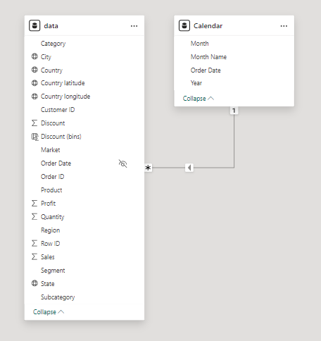
2. Building a Relational Data Model
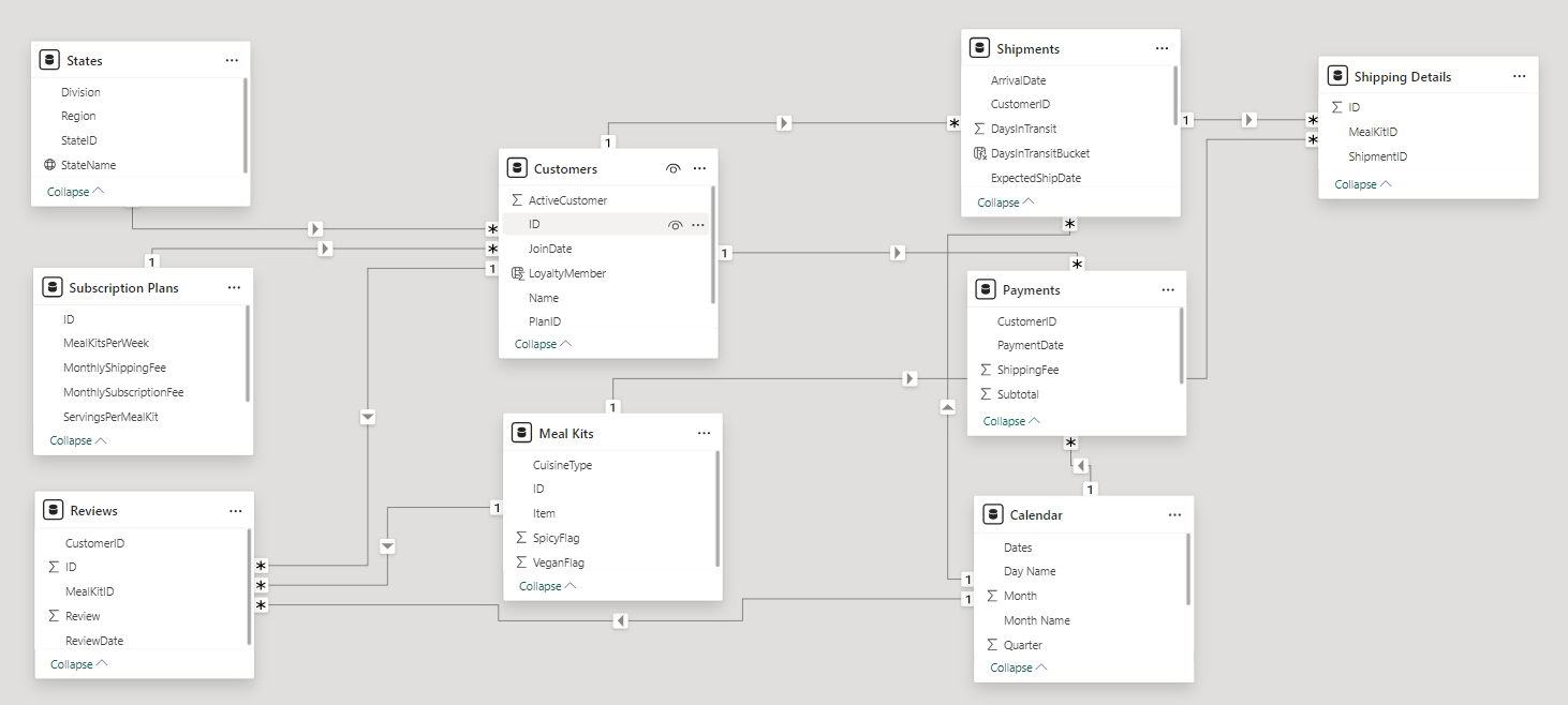
Secondly, we modeled the data to create a snowflake schema. This process involved creating relationships between the dimension and fact tables, ensuring cardinalities were one-to-many relationships.
We enabled active or inactive relationships, created hierarchies for fields such as Geography (City-State-Country-Region) and finally hid the foreign keys from the report view to ease the data analysis and visualization steps and reduce errors.
3. Creating Calculated Columns and Measures
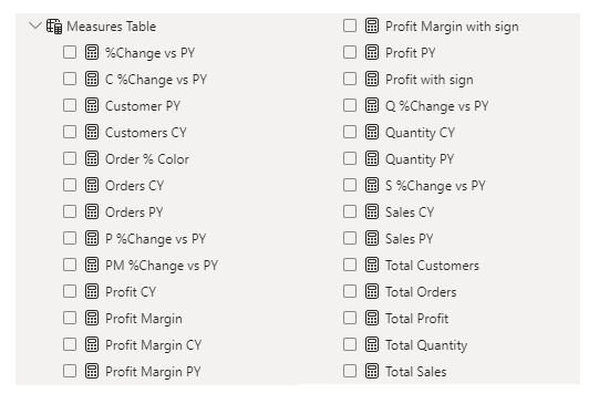
Next, we used Power BI’s front-end formula language, DAX, to analyze our relational data model and create several calculated columns (for filtering) and measures (for aggregation) that we could later reference and use when analyzing and visualizing the data.
We used calculated columns to categorize discount into defined groups. The list of calculated measures includes key information on sales, customers, orders, profit, quantity, and more.
4. Visualizing the Data
The final step of the project was creating a multi-page interactive dashboard, including a range of visuals and KPIs that could serve management and lead to informed decision-making. We used several visuals and tools to demonstrate and visualize the data across 3 report pages, including KPI cards, line, column and bar charts, matrices, donut charts, slicers, and maps. We ensured the report was fully interactive and simple to navigate, with icons used to enable filters, cancel filters, and guide users to each report page with ease. Features such as bookmarks and parameters were also used throughout the dashboard, further enhancing its usefulness and impact on management.
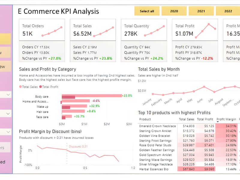
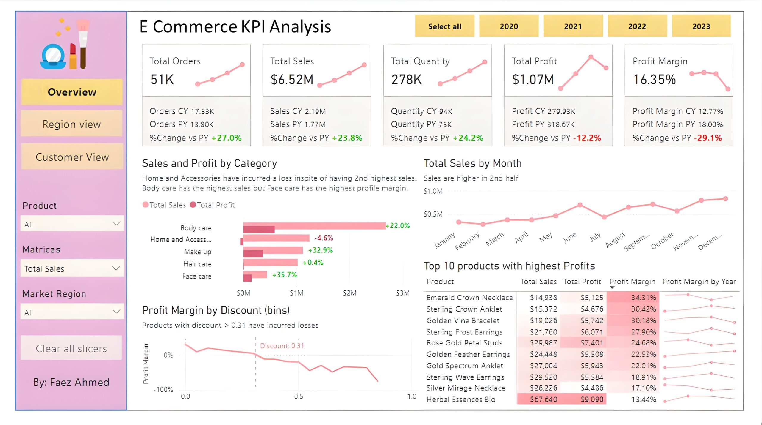
Overview Dashboard: The first report page provides a high-level view of overall performance. We used card visuals to present Key Performance Indicators such as overall sales, number of orders, quantity sold, profit and profit margin. We also included current and previous year performances of those matrices, providing insights into recent trends, a clustered bar chart to show sales and profit by product category, a line chart to display sales monthly trends, another line chart to show profit margin by discount segments, and a matrix to display the top 10 products with their overall sales, profit, profit margin profit margin by year.
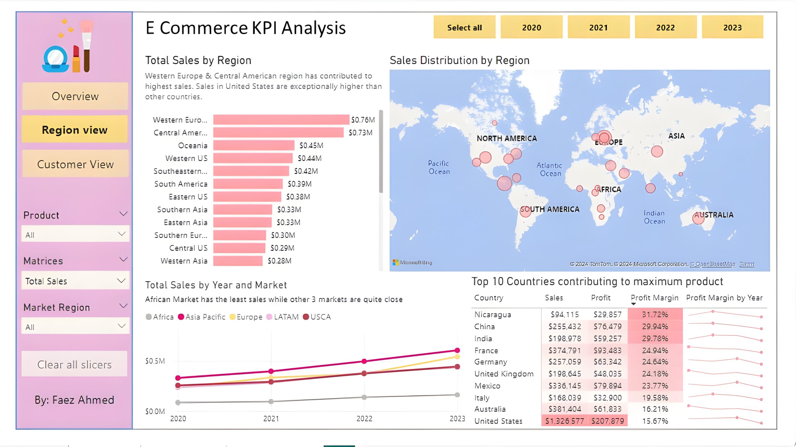
Region View: The second report page is a regional overview page to further analyze the performance in a specific region. It consists of a clustered bar chart that shows sales by regions, a map chart to display sales distribution by regions, a line chart to visualize yearly sales of markets, and a matrix chart that displays top 10 countries with their sales, profit, profit margin and profit margin by year. This offers insight into sales distribution by region.
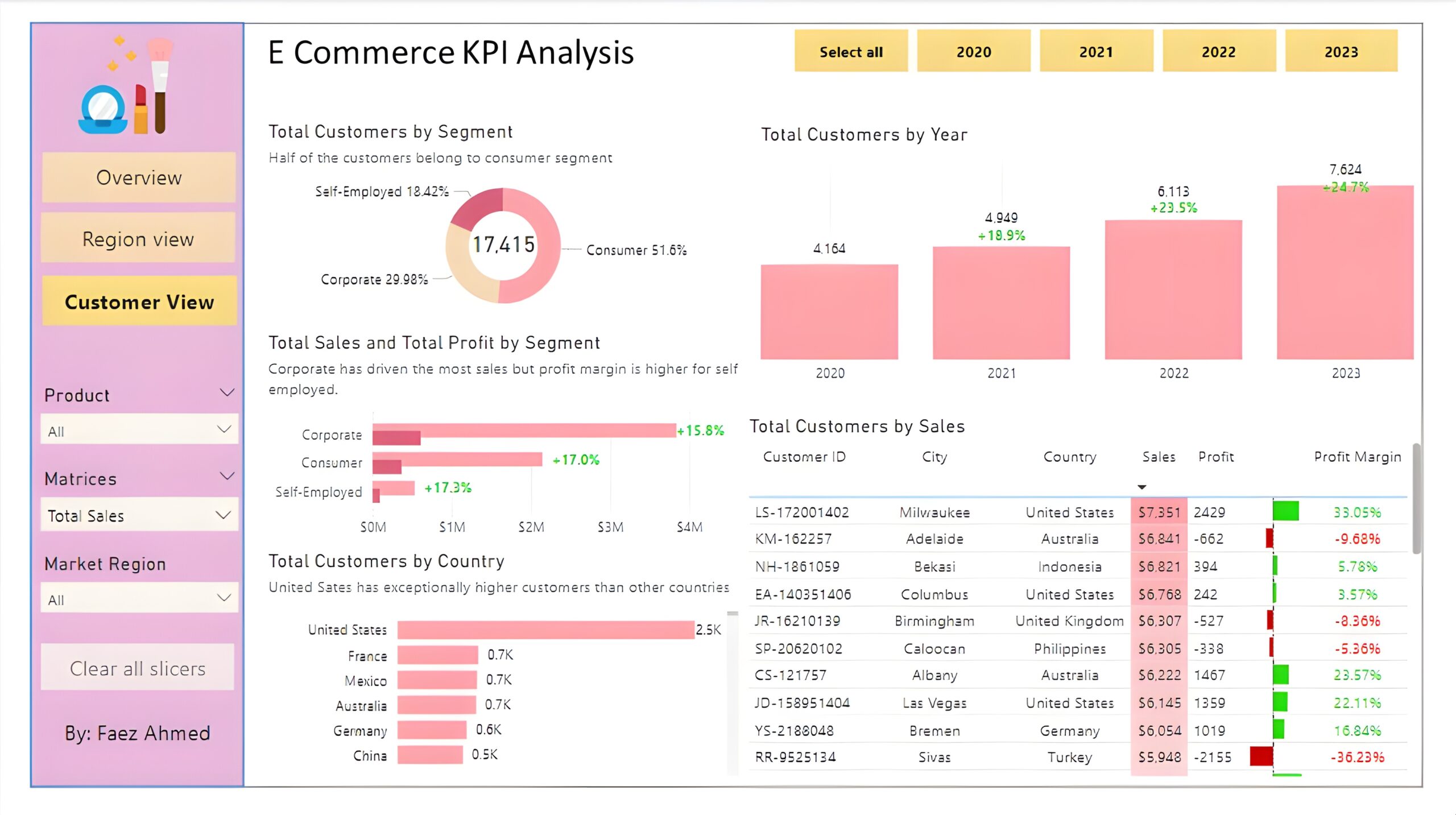
Customer View: The third and final report page provides deeper insight into customer behavior and value. It uses a donut chart to show total customers by segments, a column chart to show total customers by year, a clustered bar chart to display total sales and profit generated by segments, one more bar chart to show total customers by country, and a matrix to present customer’s purchase details, including city and country of order, sales, generated profit and profit margin.
CRM and Sales Pipelines (Power BI)
The Situation:
CRM is a collection of data related to its sales across multiple countries. It encompasses various attributes, such as total leads, conversion rate, total deal value, etc. Our goal is to transform their raw data into meaningful insights and recommendations for management. More specifically, we need to:
- Track KPIs (total leads, total deal value, leads closed, closed deal value, conversion rate, lost rate.)
- Provide insights into lead distribution across countries, industries, and organization sizes.
- Identify the health of the sales pipeline, forecast potential income over the next few months, and compare sales agent performance.
The Data:
We’ve been given a collection of raw data (CSV file), which contains information about organizations, industries, country, product, lead acquisition date, expected and closed date, and deal value, in a total of 1 table, from January 2024 to September 2024.
The Task:
We are tasked with using solely Microsoft Power BI to:
- Connect and transform/shape the data in Power BI’s back-end using Power Query
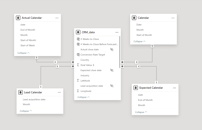
- Build a relational data model, linking the 5 fact and dimension tables
- Create calculated columns and measures with DAX
- Design a multi-page interactive dashboard to visualize the data in Power BI’s front-end
The Process:
1. Connecting and Shaping the Data
Firstly, we imported the data into the Power Query editor to transform and clean it. The process involved:
Removing Duplicates: Duplicate entries were removed from the dataset to ensure accurate analysis.
Handling Null or Missing Values: For some columns, missing values were replaced with defaults or averages. Null values in “key” columns were removed using filters.
Data Type Conversion: Columns were converted to appropriate data types to ensure consistency. Dates were converted to Date type, numerical columns to Decimal or Whole Numbers, and text columns to Text.
Column Splitting and Merging: Several columns were split to separate concatenated information or merged to create a unified name.
Standardizing Date Formats: All date columns were formatted consistently to facilitate time-based analysis. This step was important for ensuring accurate time-series analysis in Power BI.
Removing Unnecessary Columns: Irrelevant columns were removed to streamline the dataset. This helped focus the analysis on relevant information, reducing memory usage and improving performance.
2. Building a Relational Data Model
Secondly, we modeled the data to create a star schema. This process involved creating relationships between the dimension and fact tables, ensuring cardinalities were one-to-many relationships.
We enabled active or inactive relationships, created hierarchies for fields such as Date (Month-End of Month-Start of Month-Start of Week), and finally hid the foreign keys from the report view to ease the data analysis and visualization steps and reduce errors.
3. Creating Calculated Columns and Measures
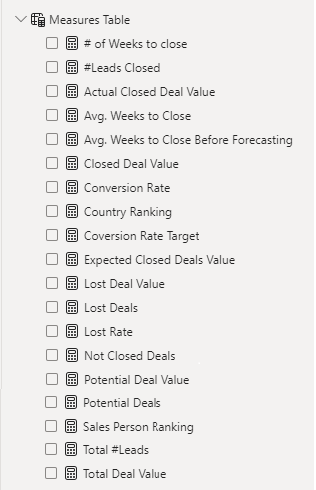
Next, we used Power BI’s front-end formula language, DAX, to analyze our relational data model and create several calculated columns (for filtering) and measures (for aggregation) that we could later reference and use when analyzing and visualizing the data. The list of calculated measures includes avg. weeks to close, # of leads closed, lost deal value, sales person ranking and more.
4. Visualizing the Data
The final step of the project was creating a multi-page interactive dashboard, including a range of visuals and KPIs that could serve management and lead to informed decision-making. We used several visuals and tools to demonstrate and visualize the data across 2 report pages, including KPI cards, line and column charts, matrices, bar charts, and pie charts. We ensured the report was fully interactive, with slicers used to enable filters, and allow users to each report page with ease. Features such as parameters were also used throughout the dashboard, further enhancing its usefulness and impact on management.
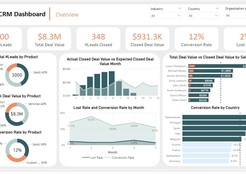
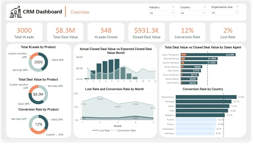
Overview Dashboard: The first report page provides a high-level view of CRM’s overview. We used card visuals to present Key Performance Indicators such as Total Leads, Total Deal Value, # Leads Closed, Closed Deal Value, Conversion Rate and Lost Rate. We also included pie charts to show distribution of total leads, total deal value and conversion rate between products, a line chart to represent monthly lost rate and conversion rate, a line and clustered column chart to compare actual closed deal value and expected closed deal value by month, a clustered bar chart to show comparison between total deal value and closed deal value by sales agent, and a clustered bar chart to display conversion rate by country.
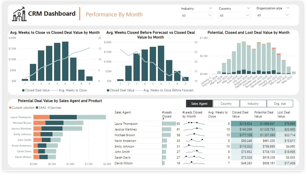
Performance by Month: The second report page is to further analyze the sales agent performance and monthly distribution of closed, expected and potential deal values. It consists of a line and clustered column chart that shows average weeks to close vs closed deal value by month, second line and clustered column chart to display average weeks closed before forecast vs closed deal value by month, a stacked column chart to show potential, closed and lost deal value from January to September 2024, a stacked column chart to display distribution of potential deal value by sales agent and product, and a matrix that visualizes performance of salespersons, countries, industries and organization size in closed leads, average weeks, and closed, potential and lost deal values, with addition of spark lines to display their monthly closed leads.
Oodles of Noodles (Power BI)
The Situation:
Oodles of Noodles is a fictional collection of data related to its sales across the United States. It encompasses various attributes, such as revenue, customer preferences, shipment time, etc. Our goal is to transform their raw data into meaningful insights and recommendations for management. More specifically, we need to:
- Track KPIs (revenue, meal kits sold, shipments, customer rating)
- Compare regional and state-level performance
- Identify high-value subscription plans and cuisine types
The Data:
We’ve been given a collection of raw data (CSV files), which contains information about shipments, returns, meal kits, customers, sales territories, and reviews, in a total of 9 tables, from the years 2020-21.
The Task:
We are tasked with using solely Microsoft Power BI to:
- Connect and transform/shape the data in Power BI’s back-end using Power Query
- Build a relational data model, linking the 9 fact and dimension tables
- Create calculated columns and measures with DAX
- Design a multi-page interactive dashboard to visualize the data in Power BI’s front-end
The Process:
1. Connecting and Shaping the Data
Firstly, we imported the data into the Power Query editor to transform and clean it. The process involved:
Removing Duplicates: Duplicate entries were removed from the dataset to ensure accurate analysis.
Handling Null or Missing Values: For some columns, missing values were replaced with defaults or averages. Null values in “key” columns were removed using filters.
Data Type Conversion: Columns were converted to appropriate data types to ensure consistency. Dates were converted to Date type, numerical columns to Decimal or Whole Numbers, and text columns to Text.
Column Splitting and Merging: Several columns were split to separate concatenated information or merged to create a unified name (such as Customer Full Name).
Standardizing Date Formats: All date columns were formatted consistently to facilitate time-based analysis. This step was important for ensuring accurate time-series analysis in Power BI.
Removing Unnecessary Columns: Irrelevant columns were removed to streamline the dataset. This helped focus the analysis on relevant information, reducing memory usage and improving performance.
2. Building a Relational Data Model
Secondly, we modeled the data to create a snowflake schema. This process involved creating relationships between the dimension and fact tables, ensuring cardinalities were one-to-many relationships. We enabled active or inactive relationships, created hierarchies for fields such as Geography (Continent-Country-Region) and Date (Start of Year-Start of Month-Start of Week-Date), and finally hid the foreign keys from the report view to ease the data analysis and visualization steps and reduce errors.
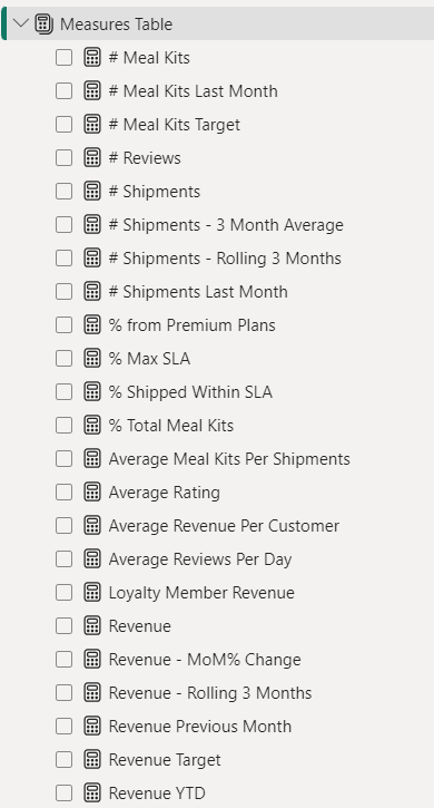
3. Creating Calculated Columns and Measures
Next, we used Power BI’s front-end formula language, DAX, to analyze our relational data model and create several calculated columns (for filtering) and measures (for aggregation) that we could later reference and use when analyzing and visualizing the data. We used calculated columns to determine whether a customer is active and a loyal member. The list of calculated measures includes key information on revenue, total shipments, reviews, SLA, and more.
4. Visualizing the Data
The final step of the project was creating a multi-page interactive dashboard, including a range of visuals and KPIs that could serve management and lead to informed decision-making. We used several visuals and tools to demonstrate and visualize the data across 4 report pages, including KPI cards, line and bar charts, matrices, gauge charts, and tree maps. We ensured the report was fully interactive and simple to navigate, with icons used to enable filters, cancel filters, and guide users to each report page with ease. Features such as drill-through, bookmarks, parameters, and tooltips were also used throughout the dashboard, further enhancing its usefulness and impact on management.
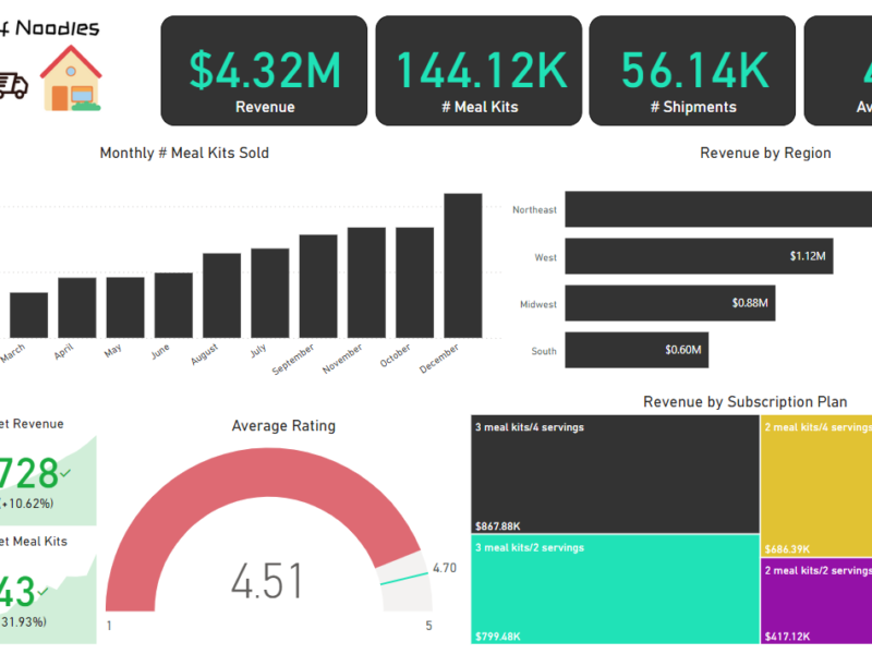
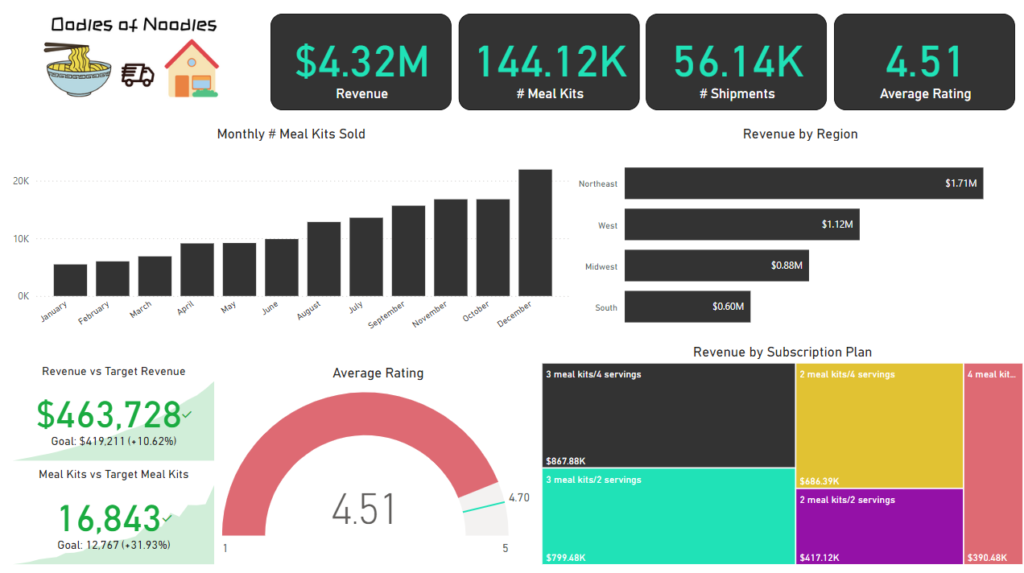
Executive Dashboard: The first report page provides a high-level view of Oodles of Noodles’ overall performance. We used card visuals to present Key Performance Indicators such as overall revenue, number of meal kits sold, total shipments, and average rating by customers. We also included additional cards to compare current and previous month performances, providing insights into recent trends, a clustered bar chart to show revenue by region, a gauge chart to display ratings by customers, and a tree map to display the top 5 subscription plans by revenue.
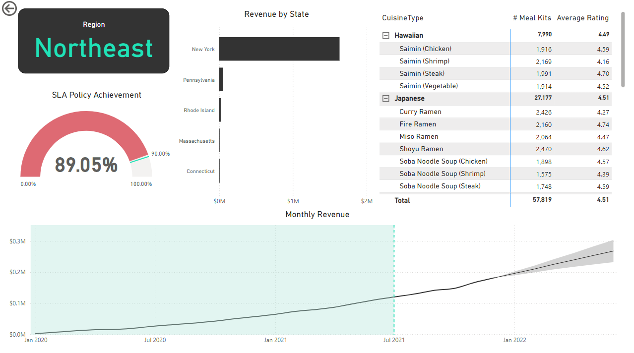
Region: The second report page is a drill-through page by region to further analyze the performance in a specific region. It consists of a bar chart that shows revenue by states in a region, a matrix to display cuisine types by the number of meal kits sold and average ratings, a gauge chart to analyze the SLA policy implementation, and a line chart that visualizes the trending revenue from 2020-2021 and highlights long-term performance. This offers insight into Oodles of Noodles’ sales distribution by region and state.
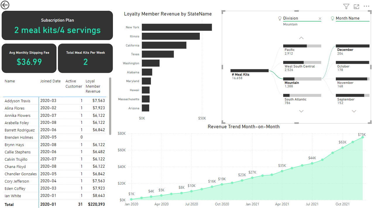
Subscription: The third report page focuses on detailed subscription-level analysis. It displays information such as average monthly shipping fee and total meal kits by subscription plan, a clustered bar chart to visualize loyalty member revenue by state, a matrix that displays the top 30 customers by revenue for the subscription plan, a decomposition tree that displays meal kits by region and month, and a line chart that displays month-on-month revenue trends for the years 2020-2021.
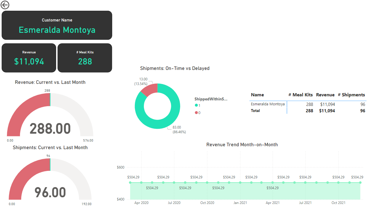
Customer Detail: The fourth and final report page provides deeper insight into customer behavior and value. It uses gauge charts to show revenue comparison for the current and last month and shipments for the current vs last month, a donut chart to show delayed vs on-time delivery to customers, a matrix for the number of meal kits, revenue, and shipments for customers, and a line chart that displays month-on-month revenue.
Adventure Works (Power BI)
The Situation:
Adventure Works is a fictional global manufacturing company that produces cycling equipment and accessories, with activities stretching across three continents (North America, Europe, and Oceania). Our goal is to transform their raw data into meaningful insights and recommendations for management. More specifically, we need to:
- Track KPIs (sales, revenue, profit, returns)
- Compare regional performance
- Analyse product-level trends
- Identify high-value customers
The Data:
We’ve been given a collection of raw data (CSV files), which contain information about transactions, returns, products, customers, and sales territories in a total of eight tables, spanning from the years 2020 to 2022.
The Task: We are tasked with using solely Microsoft Power BI to:
- Connect and transform/shape the data in Power BI’s back-end using Power Query
- Build a relational data model, linking the 8 fact and dimension tables
- Create calculated columns and measures with DAX
- Design a multi-page interactive dashboard to visualize the data in Power BI’s front-end
The Process:
1. Connecting and Shaping the Data
Firstly, we imported the data into the Power Query editor to transform and clean it. The next process involved:
Removing Duplicates: Duplicate entries were removed from the dataset to ensure accurate analysis.
Handling Null or Missing Values: For some columns, missing values were replaced with defaults or averages. Null values in “key” columns were removed using filters.
Data Type Conversion: Columns were converted to appropriate data types to ensure consistency. Dates were converted to Date type, numerical columns to Decimal or Whole Numbers, and text columns to Text.
Column Splitting and Merging: Several columns were split to separate concatenated information, or merged to create a unified name (such as Customer Full Name).
Standardising Date Formats: All date columns were formatted consistently to facilitate time-based analysis. This step was important for ensuring accurate time-series analysis in Power BI.
Removing Unnecessary Columns: Irrelevant columns were removed to streamline the dataset. This helped focus the analysis on relevant information, reducing memory usage and improving performance.
2. Building a Relational Data Model
Secondly, we modeled the data to create a snowflake schema. This process involved creating relationships between the dimension and fact tables, ensuring cardinalities were one-to-many relationships.
Enabling active or inactive relationships, creating hierarchies for fields such as Geography (Continent-Country-Region) and Date (Start of Year-Start of Month-Start of Week-Date), and finally hiding the foreign keys from report view to ease the data analysis and visualization steps and reduce errors.

3. Creating Calculated Columns and Measures
Next, we used Power BI’s front-end formula language, DAX, to analyze our relational data model and create several calculated columns (for filtering) and measures (for aggregation), that we could later reference and use when analyzing and visualizing the data.
We used calculated columns to determine whether a customer is a parent (Yes/No), a customer’s income level (Very High/High/Average/Low), a customer’s priority status (Priority/ Standard), and the customer’s educational level (High School/ Undergrad/ Graduate).
The list of calculated measures is available below and includes key information on revenue, profit, orders, returns, and more.

4. Visualising the Data
The final step of the project was creating a multi-page interactive dashboard, including a range of visuals and KPIs that could serve management and lead to informed decision-making. We used several visuals and tools to demonstrate and visualize the data across the 4 report pages, including KPI cards, line and bar charts, matrices, gauge charts, maps, donut charts, and slicers. We made sure the report was fully interactive and simple to navigate, with icons used to enable filters, cancel filters, and guide users to each report page with ease. Features such as drill-through, bookmarks, parameters, and tooltips were also used throughout the dashboard, further enhancing its usefulness and impact on management.
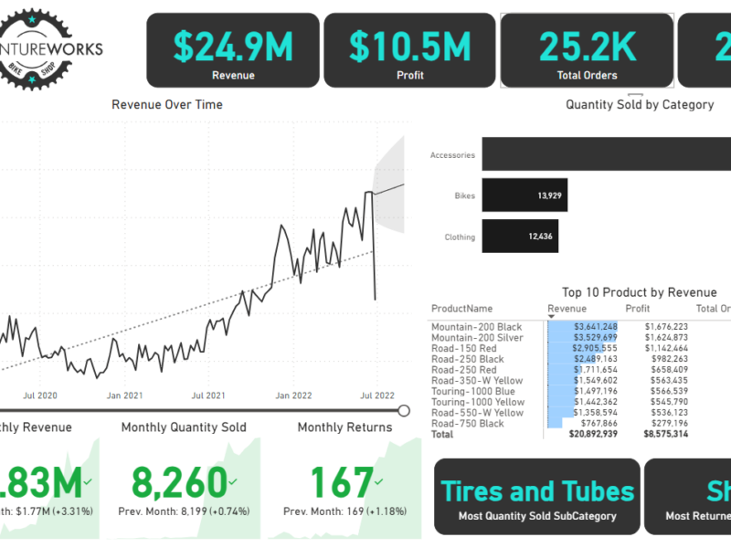
Executive Dashboard: The first report page provides a high-level view of Adventure Works’ overall performance. We used card visuals to present Key Performance Indicators such as overall revenue, profit margins, total orders, and return rates. We also included additional cards to compare current and previous month performances, providing insights into recent trends, a line chart to visualize the trending revenue from 2020-2022 and highlight long-term performance, and presented the number of orders by product category to aid in understanding product sales distribution, and used a further table to display the top 10 products based on key indicators (total orders, revenue, and return rate).

Map: The second report page consisted of a map visual, an interactive representation of sales volume across different geographical locations. This offered insight into Adventure Works’ global sales distribution and worldwide reach.

Product Detail: The third report page focuses on detailed product-level analysis. It displayed detailed product information for the selected top 10 products from the Executive Dashboard, using the drill-through feature. It also included gauge charts presenting actual performance vs target performance of monthly orders, revenue, and profit, and included an interactive line chart to visualize potential profit adjustments when manipulating the price of the product, aiding in strategic decision-making regarding pricing strategies. This report page also included a line chart including key weekly product information on total orders, revenue, profit, returns, and return rate.

Customer Detail: The fourth and final report page provided a deeper insight into customer behavior and value. It used donut charts to break down customer groups into income level and occupation categories vs. total orders, helping in customer segmentation tactics, and used a matrix aided by KPI cards to identify high-value customers based on order and revenue contributions, aiding in identifying high-value customers and sales opportunities.
