Hi, I’m Syed Faez Ahmed
a
Data Analyst
Sales Manager
Reporting Analyst
An MBA-qualified and experienced professional, with extensive knowledge and exposure in Financial Reporting and analysis, Business Development, Sales Operations, Distribution, and Team management. Seeking a growth-oriented challenging position for career development by utilizing my abilities, and skills through my education, knowledge, and hands-on experience.

What I Do
Data Analyst
I possess strong skills in data analysis, including the ability to collect, analyze, and interpret large datasets to extract actionable insights. My expertise extends to statistical techniques and programming languages such as SQL and Python, enabling me to conduct thorough analyses and derive meaningful conclusions. Additionally, I am proficient in utilizing data visualization tools to present findings in a clear and concise manner, facilitating effective communication of insights to stakeholders.
Business Intelligence
With experience as a Business Intelligence Specialist, I have honed my ability to transform raw data into valuable insights that drive strategic decision-making within organizations. My proficiency lies in data modeling, reporting, and dashboard creation, allowing me to provide comprehensive business insights to stakeholders at all levels. I am adept at leveraging various tools and technologies to ensure the delivery of actionable insights that contribute to organizational success.
Power BI Specialist
As a Power BI Specialist, I excel in utilizing Microsoft Power BI for data visualization and analysis purposes. My skills include designing interactive dashboards, creating robust data models, and performing advanced analytics to empower users with intuitive reports and visualizations. By leveraging Power BI, I facilitate informed decision-making processes across the organization, enabling stakeholders to gain valuable insights into business performance and trends.
My Portfolio
The Situation:
Adventure Works is a fictional global manufacturing company that produces cycling equipment and accessories, with activities stretching across three continents (North America, Europe, and Oceania). Our goal is to transform their raw data into meaningful insights and recommendations for management. More specifically, we need to:
- Track KPIs (sales, revenue, profit, returns)
- Compare regional performance
- Analyse product-level trends
- Identify high-value customers
The Data:
We’ve been given a collection of raw data (CSV files), which contain information about transactions, returns, products, customers, and sales territories in a total of eight tables, spanning from the years 2020 to 2022.
The Task: We are tasked with using solely Microsoft Power BI to:
- Connect and transform/shape the data in Power BI’s back-end using Power Query
- Build a relational data model, linking the 8 fact and dimension tables
- Create calculated columns and measures with DAX
- Design a multi-page interactive dashboard to visualize the data in Power BI’s front-end
The Process:
1. Connecting and Shaping the Data
Firstly, we imported the data into the Power Query editor to transform and clean it. The next process involved:
Removing Duplicates: Duplicate entries were removed from the dataset to ensure accurate analysis.
Handling Null or Missing Values: For some columns, missing values were replaced with defaults or averages. Null values in “key” columns were removed using filters.
Data Type Conversion: Columns were converted to appropriate data types to ensure consistency. Dates were converted to Date type, numerical columns to Decimal or Whole Numbers, and text columns to Text.
Column Splitting and Merging: Several columns were split to separate concatenated information, or merged to create a unified name (such as Customer Full Name).
Standardising Date Formats: All date columns were formatted consistently to facilitate time-based analysis. This step was important for ensuring accurate time-series analysis in Power BI.
Removing Unnecessary Columns: Irrelevant columns were removed to streamline the dataset. This helped focus the analysis on relevant information, reducing memory usage and improving performance.
2. Building a Relational Data Model
Secondly, we modeled the data to create a snowflake schema. This process involved creating relationships between the dimension and fact tables, ensuring cardinalities were one-to-many relationships.
Enabling active or inactive relationships, creating hierarchies for fields such as Geography (Continent-Country-Region) and Date (Start of Year-Start of Month-Start of Week-Date), and finally hiding the foreign keys from report view to ease the data analysis and visualization steps and reduce errors.

3. Creating Calculated Columns and Measures
Next, we used Power BI’s front-end formula language, DAX, to analyze our relational data model and create several calculated columns (for filtering) and measures (for aggregation), that we could later reference and use when analyzing and visualizing the data.
We used calculated columns to determine whether a customer is a parent (Yes/No), a customer’s income level (Very High/High/Average/Low), a customer’s priority status (Priority/ Standard), and the customer’s educational level (High School/ Undergrad/ Graduate).
The list of calculated measures is available below and includes key information on revenue, profit, orders, returns, and more.

4. Visualising the Data
The final step of the project was creating a multi-page interactive dashboard, including a range of visuals and KPIs that could serve management and lead to informed decision-making. We used several visuals and tools to demonstrate and visualize the data across the 4 report pages, including KPI cards, line and bar charts, matrices, gauge charts, maps, donut charts, and slicers. We made sure the report was fully interactive and simple to navigate, with icons used to enable filters, cancel filters, and guide users to each report page with ease. Features such as drill-through, bookmarks, parameters, and tooltips were also used throughout the dashboard, further enhancing its usefulness and impact on management.
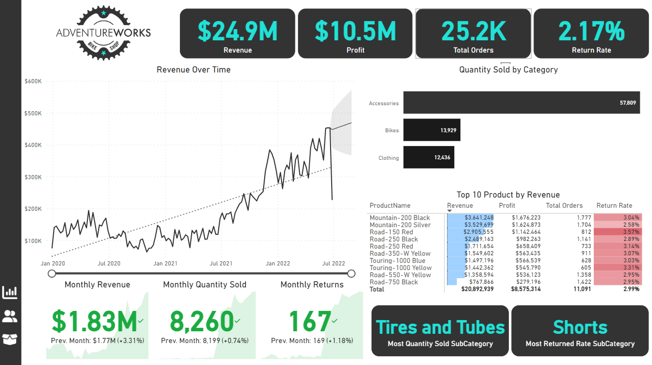
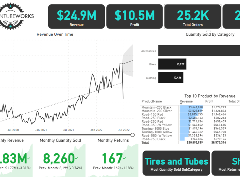
Executive Dashboard: The first report page provides a high-level view of Adventure Works’ overall performance. We used card visuals to present Key Performance Indicators such as overall revenue, profit margins, total orders, and return rates. We also included additional cards to compare current and previous month performances, providing insights into recent trends, a line chart to visualize the trending revenue from 2020-2022 and highlight long-term performance, and presented the number of orders by product category to aid in understanding product sales distribution, and used a further table to display the top 10 products based on key indicators (total orders, revenue, and return rate).

Map: The second report page consisted of a map visual, an interactive representation of sales volume across different geographical locations. This offered insight into Adventure Works’ global sales distribution and worldwide reach.

Product Detail: The third report page focuses on detailed product-level analysis. It displayed detailed product information for the selected top 10 products from the Executive Dashboard, using the drill-through feature. It also included gauge charts presenting actual performance vs target performance of monthly orders, revenue, and profit, and included an interactive line chart to visualize potential profit adjustments when manipulating the price of the product, aiding in strategic decision-making regarding pricing strategies. This report page also included a line chart including key weekly product information on total orders, revenue, profit, returns, and return rate.

Customer Detail: The fourth and final report page provided a deeper insight into customer behavior and value. It used donut charts to break down customer groups into income level and occupation categories vs. total orders, helping in customer segmentation tactics, and used a matrix aided by KPI cards to identify high-value customers based on order and revenue contributions, aiding in identifying high-value customers and sales opportunities.

Oodles of Noodles (Power BI)
The Situation:
Oodles of Noodles is a fictional collection of data related to its sales across the United States. It encompasses various attributes, such as revenue, customer preferences, shipment time, etc. Our goal is to transform their raw data into meaningful insights and recommendations for management. More specifically, we need to:
- Track KPIs (revenue, meal kits sold, shipments, customer rating)
- Compare regional and state-level performance
- Identify high-value subscription plans and cuisine types
The Data:
We’ve been given a collection of raw data (CSV files), which contains information about shipments, returns, meal kits, customers, sales territories, and reviews, in a total of 9 tables, from the years 2020-21.
The Task:
We are tasked with using solely Microsoft Power BI to:
- Connect and transform/shape the data in Power BI’s back-end using Power Query
- Build a relational data model, linking the 9 fact and dimension tables
- Create calculated columns and measures with DAX
- Design a multi-page interactive dashboard to visualize the data in Power BI’s front-end
The Process:
1. Connecting and Shaping the Data
Firstly, we imported the data into the Power Query editor to transform and clean it. The process involved:
Removing Duplicates: Duplicate entries were removed from the dataset to ensure accurate analysis.
Handling Null or Missing Values: For some columns, missing values were replaced with defaults or averages. Null values in “key” columns were removed using filters.
Data Type Conversion: Columns were converted to appropriate data types to ensure consistency. Dates were converted to Date type, numerical columns to Decimal or Whole Numbers, and text columns to Text.
Column Splitting and Merging: Several columns were split to separate concatenated information or merged to create a unified name (such as Customer Full Name).
Standardizing Date Formats: All date columns were formatted consistently to facilitate time-based analysis. This step was important for ensuring accurate time-series analysis in Power BI.
Removing Unnecessary Columns: Irrelevant columns were removed to streamline the dataset. This helped focus the analysis on relevant information, reducing memory usage and improving performance.
2. Building a Relational Data Model
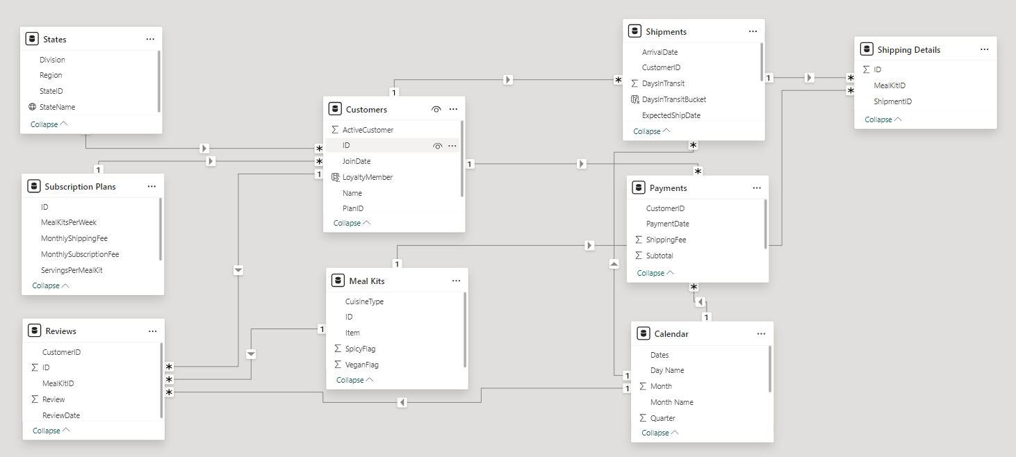
Secondly, we modeled the data to create a snowflake schema. This process involved creating relationships between the dimension and fact tables, ensuring cardinalities were one-to-many relationships. We enabled active or inactive relationships, created hierarchies for fields such as Geography (Continent-Country-Region) and Date (Start of Year-Start of Month-Start of Week-Date), and finally hid the foreign keys from the report view to ease the data analysis and visualization steps and reduce errors.
3. Creating Calculated Columns and Measures
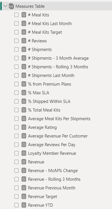
Next, we used Power BI’s front-end formula language, DAX, to analyze our relational data model and create several calculated columns (for filtering) and measures (for aggregation) that we could later reference and use when analyzing and visualizing the data. We used calculated columns to determine whether a customer is active and a loyal member. The list of calculated measures includes key information on revenue, total shipments, reviews, SLA, and more.
4. Visualizing the Data
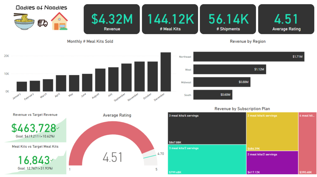
The final step of the project was creating a multi-page interactive dashboard, including a range of visuals and KPIs that could serve management and lead to informed decision-making. We used several visuals and tools to demonstrate and visualize the data across 4 report pages, including KPI cards, line and bar charts, matrices, gauge charts, and tree maps. We ensured the report was fully interactive and simple to navigate, with icons used to enable filters, cancel filters, and guide users to each report page with ease. Features such as drill-through, bookmarks, parameters, and tooltips were also used throughout the dashboard, further enhancing its usefulness and impact on management.
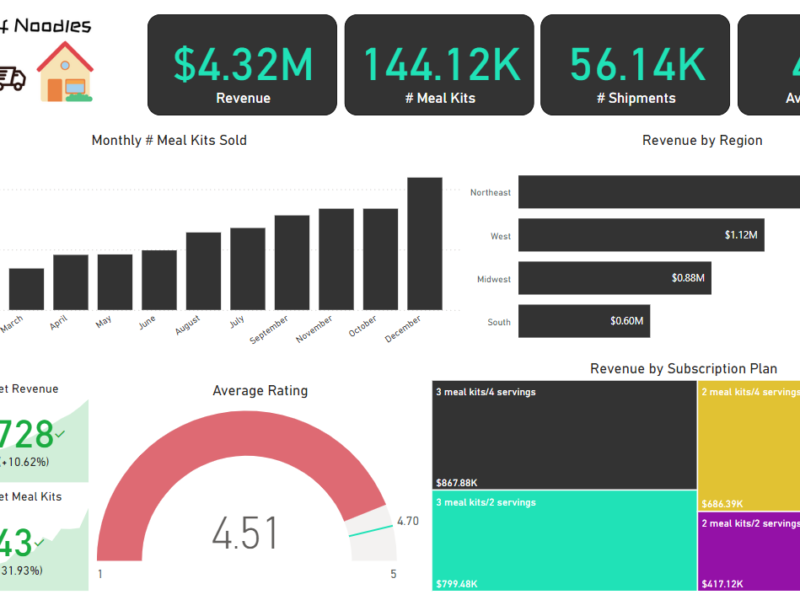
Executive Dashboard: The first report page provides a high-level view of Oodles of Noodles’ overall performance. We used card visuals to present Key Performance Indicators such as overall revenue, number of meal kits sold, total shipments, and average rating by customers. We also included additional cards to compare current and previous month performances, providing insights into recent trends, a clustered bar chart to show revenue by region, a gauge chart to display ratings by customers, and a tree map to display the top 5 subscription plans by revenue.
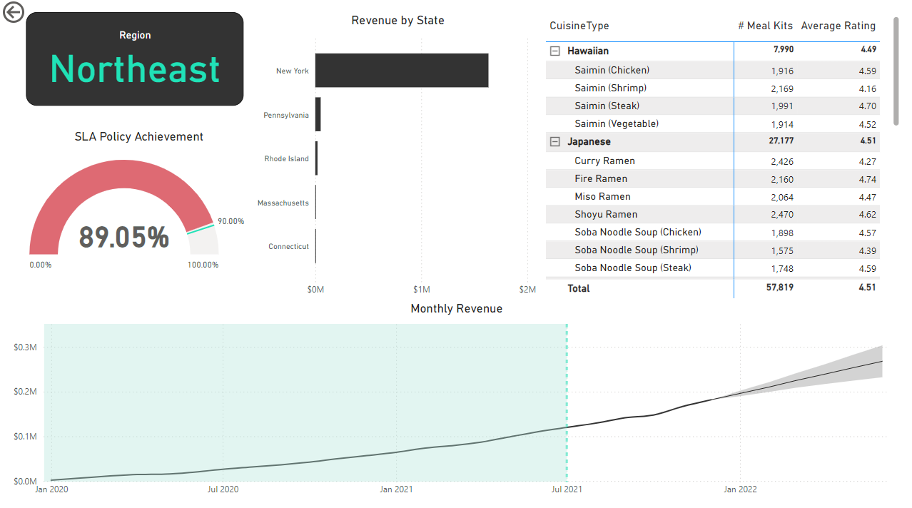
Region: The second report page is a drill-through page by region to further analyze the performance in a specific region. It consists of a bar chart that shows revenue by states in a region, a matrix to display cuisine types by the number of meal kits sold and average ratings, a gauge chart to analyze the SLA policy implementation, and a line chart that visualizes the trending revenue from 2020-2021 and highlights long-term performance. This offers insight into Oodles of Noodles’ sales distribution by region and state.
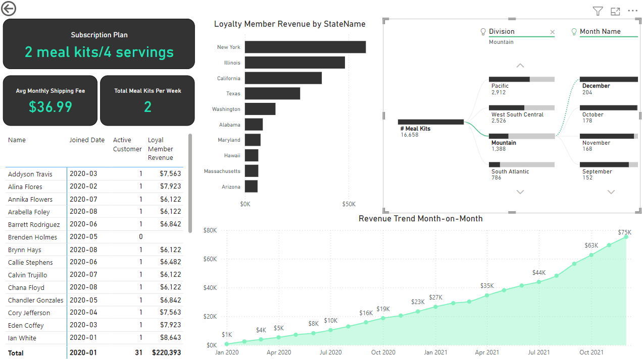
Subscription: The third report page focuses on detailed subscription-level analysis. It displays information such as average monthly shipping fee and total meal kits by subscription plan, a clustered bar chart to visualize loyalty member revenue by state, a matrix that displays the top 30 customers by revenue for the subscription plan, a decomposition tree that displays meal kits by region and month, and a line chart that displays month-on-month revenue trends for the years 2020-2021.
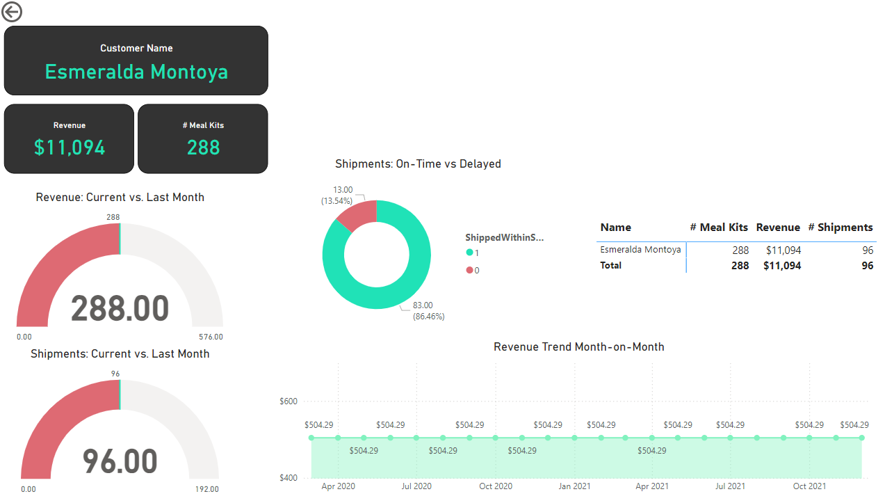
Customer Detail: The fourth and final report page provides deeper insight into customer behavior and value. It uses gauge charts to show revenue comparison for the current and last month and shipments for the current vs last month, a donut chart to show delayed vs on-time delivery to customers, a matrix for the number of meal kits, revenue, and shipments for customers, and a line chart that displays month-on-month revenue.
CRM and Sales Pipelines (Power BI)
The Situation:
CRM is a collection of data related to its sales across multiple countries. It encompasses various attributes, such as total leads, conversion rate, total deal value, etc. Our goal is to transform their raw data into meaningful insights and recommendations for management. More specifically, we need to:
- Track KPIs (total leads, total deal value, leads closed, closed deal value, conversion rate, lost rate.)
- Provide insights into lead distribution across countries, industries, and organization sizes.
- Identify the health of the sales pipeline, forecast potential income over the next few months, and compare sales agent performance.
The Data:
We’ve been given a collection of raw data (CSV file), which contains information about organizations, industries, country, product, lead acquisition date, expected and closed date, and deal value, in a total of 1 table, from January 2024 to September 2024.
The Task:
We are tasked with using solely Microsoft Power BI to:
- Connect and transform/shape the data in Power BI’s back-end using Power Query
- Build a relational data model, linking the 5 fact and dimension tables
- Create calculated columns and measures with DAX
- Design a multi-page interactive dashboard to visualize the data in Power BI’s front-end
The Process:
1. Connecting and Shaping the Data
Firstly, we imported the data into the Power Query editor to transform and clean it. The process involved:
Removing Duplicates: Duplicate entries were removed from the dataset to ensure accurate analysis.
Handling Null or Missing Values: For some columns, missing values were replaced with defaults or averages. Null values in “key” columns were removed using filters.
Data Type Conversion: Columns were converted to appropriate data types to ensure consistency. Dates were converted to Date type, numerical columns to Decimal or Whole Numbers, and text columns to Text.
Column Splitting and Merging: Several columns were split to separate concatenated information or merged to create a unified name.
Standardizing Date Formats: All date columns were formatted consistently to facilitate time-based analysis. This step was important for ensuring accurate time-series analysis in Power BI.
Removing Unnecessary Columns: Irrelevant columns were removed to streamline the dataset. This helped focus the analysis on relevant information, reducing memory usage and improving performance.
2. Building a Relational Data Model
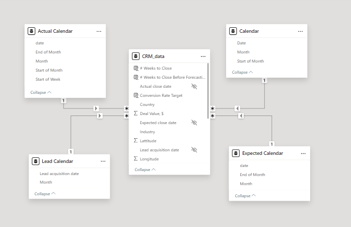
Secondly, we modeled the data to create a star schema. This process involved creating relationships between the dimension and fact tables, ensuring cardinalities were one-to-many relationships.
We enabled active or inactive relationships, created hierarchies for fields such as Date (Month-End of Month-Start of Month-Start of Week), and finally hid the foreign keys from the report view to ease the data analysis and visualization steps and reduce errors.
3. Creating Calculated Columns and Measures
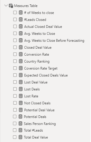
Next, we used Power BI’s front-end formula language, DAX, to analyze our relational data model and create several calculated columns (for filtering) and measures (for aggregation) that we could later reference and use when analyzing and visualizing the data. The list of calculated measures includes avg. weeks to close, # of leads closed, lost deal value, sales person ranking and more.
4. Visualizing the Data
The final step of the project was creating a multi-page interactive dashboard, including a range of visuals and KPIs that could serve management and lead to informed decision-making. We used several visuals and tools to demonstrate and visualize the data across 2 report pages, including KPI cards, line and column charts, matrices, bar charts, and pie charts. We ensured the report was fully interactive, with slicers used to enable filters, and allow users to each report page with ease. Features such as parameters were also used throughout the dashboard, further enhancing its usefulness and impact on management.
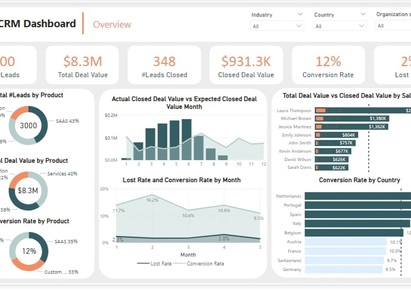
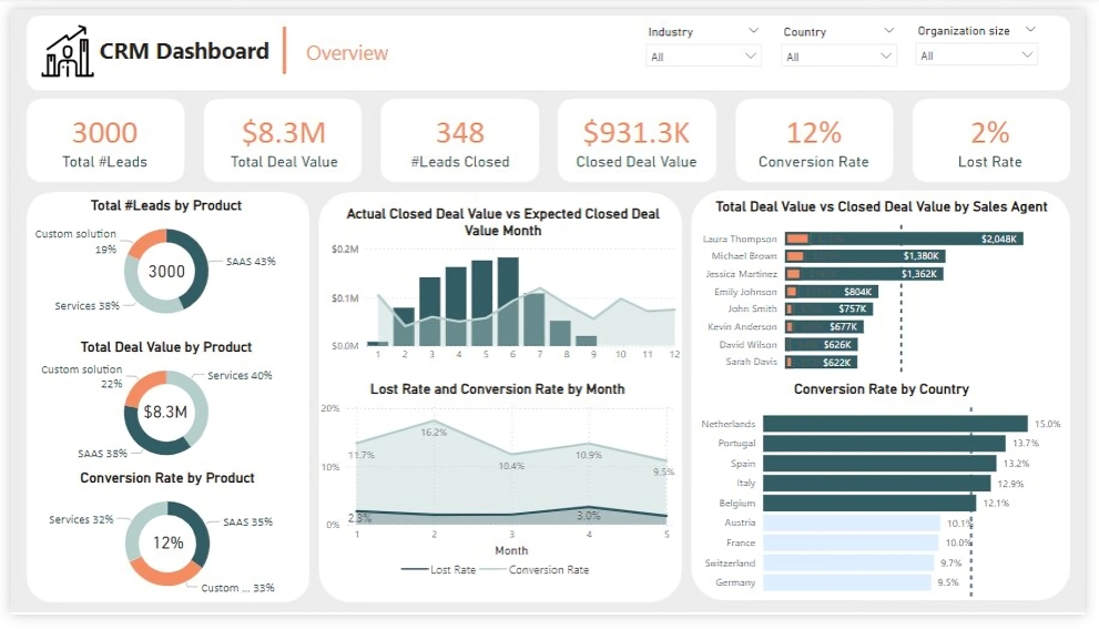
Overview Dashboard: The first report page provides a high-level view of CRM’s overview. We used card visuals to present Key Performance Indicators such as Total Leads, Total Deal Value, # Leads Closed, Closed Deal Value, Conversion Rate and Lost Rate. We also included pie charts to show distribution of total leads, total deal value and conversion rate between products, a line chart to represent monthly lost rate and conversion rate, a line and clustered column chart to compare actual closed deal value and expected closed deal value by month, a clustered bar chart to show comparison between total deal value and closed deal value by sales agent, and a clustered bar chart to display conversion rate by country.
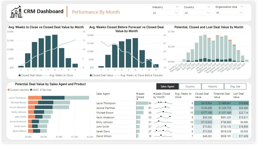
Performance by Month: The second report page is to further analyze the sales agent performance and monthly distribution of closed, expected and potential deal values. It consists of a line and clustered column chart that shows average weeks to close vs closed deal value by month, second line and clustered column chart to display average weeks closed before forecast vs closed deal value by month, a stacked column chart to show potential, closed and lost deal value from January to September 2024, a stacked column chart to display distribution of potential deal value by sales agent and product, and a matrix that visualizes performance of salespersons, countries, industries and organization size in closed leads, average weeks, and closed, potential and lost deal values, with addition of spark lines to display their monthly closed leads.
E-commerce KPI Analysis (Power BI)
The Situation:
E-commerce KPI Analysis is a collection of data related to its sales across multiple countries around the world. It encompasses various attributes, such as orders, sales, products, market, etc. Our goal is to transform their raw data into meaningful insights and recommendations for management. More specifically, we need to:
- Track KPIs (orders, sales, profit, quantity, profit margin)
- Compare regional and state-level performance
- Identify product effectiveness and customer behavior
The Data:
We’ve been given a collection of raw data (CSV files), which contains information about orders, quantity, sales, discount, products, categories, customers, segments, regions, markets and others, in a total of a single table, from the years 2020-23.
The Task:
We are tasked with using solely Microsoft Power BI to:
- Connect and transform/shape the data in Power BI’s back-end using Power Query
- Build a relational data model, linking the 2 fact and dimension tables
- Create calculated columns and measures with DAX
- Design a multi-page interactive dashboard to visualize the data in Power BI’s front-end
The Process:
1. Connecting and Shaping the Data
Firstly, we imported the data into the Power Query editor to transform and clean it. The process involved:
Removing Duplicates: Duplicate entries were removed from the dataset to ensure accurate analysis.
Data Type Conversion: Columns were converted to appropriate data types to ensure consistency. Dates were converted to Date type, numerical columns to Decimal or Whole Numbers, and text columns to Text.
Standardizing Date Formats: All date columns were formatted consistently to facilitate time-based analysis. This step was important for ensuring accurate time-series analysis in Power BI.
2. Building a Relational Data Model
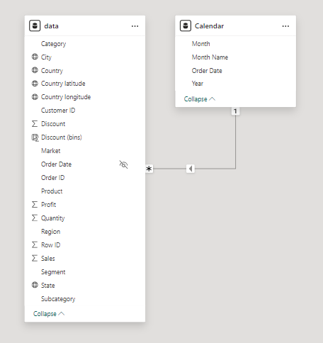
Secondly, we modeled the data to create a snowflake schema. This process involved creating relationships between the dimension and fact tables, ensuring cardinalities were one-to-many relationships.
We enabled active or inactive relationships, created hierarchies for fields such as Geography (City-State-Country-Region) and finally hid the foreign keys from the report view to ease the data analysis and visualization steps and reduce errors.
3. Creating Calculated Columns and Measures
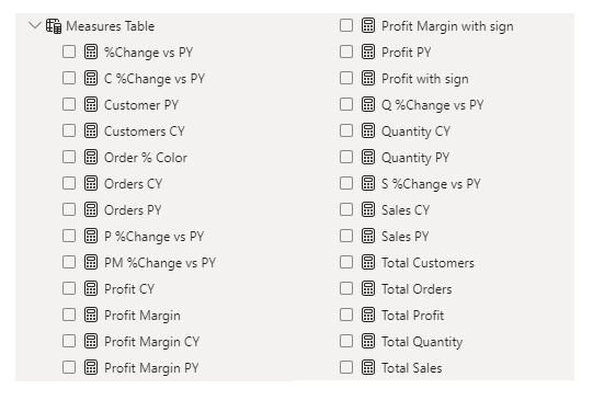
Next, we used Power BI’s front-end formula language, DAX, to analyze our relational data model and create several calculated columns (for filtering) and measures (for aggregation) that we could later reference and use when analyzing and visualizing the data.
We used calculated columns to categorize discount into defined groups. The list of calculated measures includes key information on sales, customers, orders, profit, quantity, and more.
4. Visualizing the Data
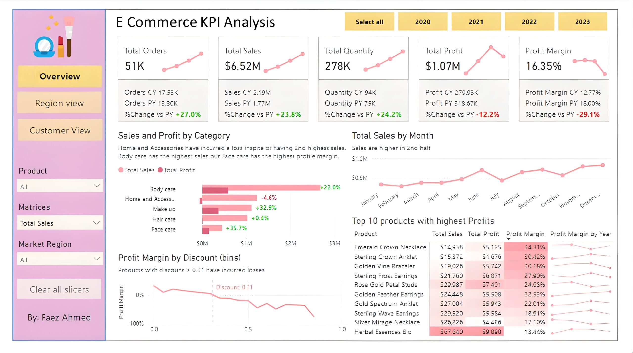
The final step of the project was creating a multi-page interactive dashboard, including a range of visuals and KPIs that could serve management and lead to informed decision-making. We used several visuals and tools to demonstrate and visualize the data across 3 report pages, including KPI cards, line, column and bar charts, matrices, donut charts, slicers, and maps. We ensured the report was fully interactive and simple to navigate, with icons used to enable filters, cancel filters, and guide users to each report page with ease. Features such as bookmarks and parameters were also used throughout the dashboard, further enhancing its usefulness and impact on management.
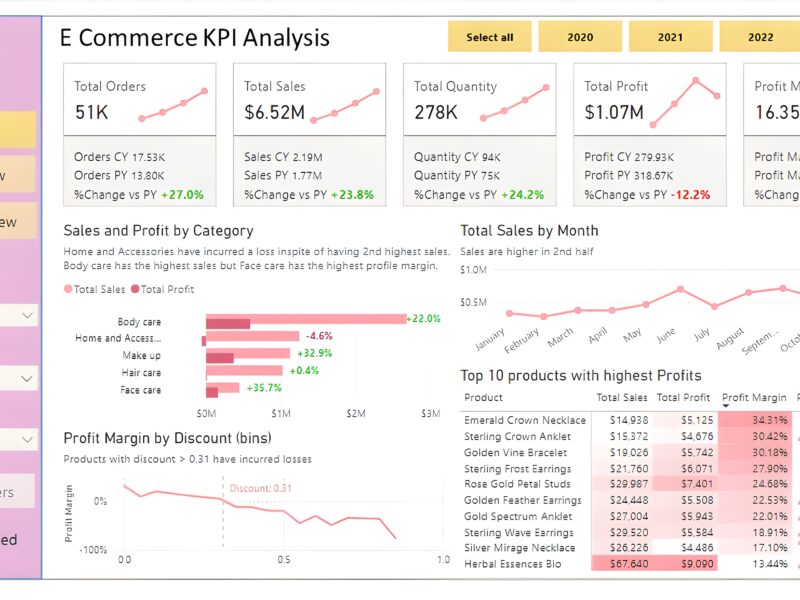
Overview Dashboard: The first report page provides a high-level view of overall performance. We used card visuals to present Key Performance Indicators such as overall sales, number of orders, quantity sold, profit and profit margin. We also included current and previous year performances of those matrices, providing insights into recent trends, a clustered bar chart to show sales and profit by product category, a line chart to display sales monthly trends, another line chart to show profit margin by discount segments, and a matrix to display the top 10 products with their overall sales, profit, profit margin profit margin by year.
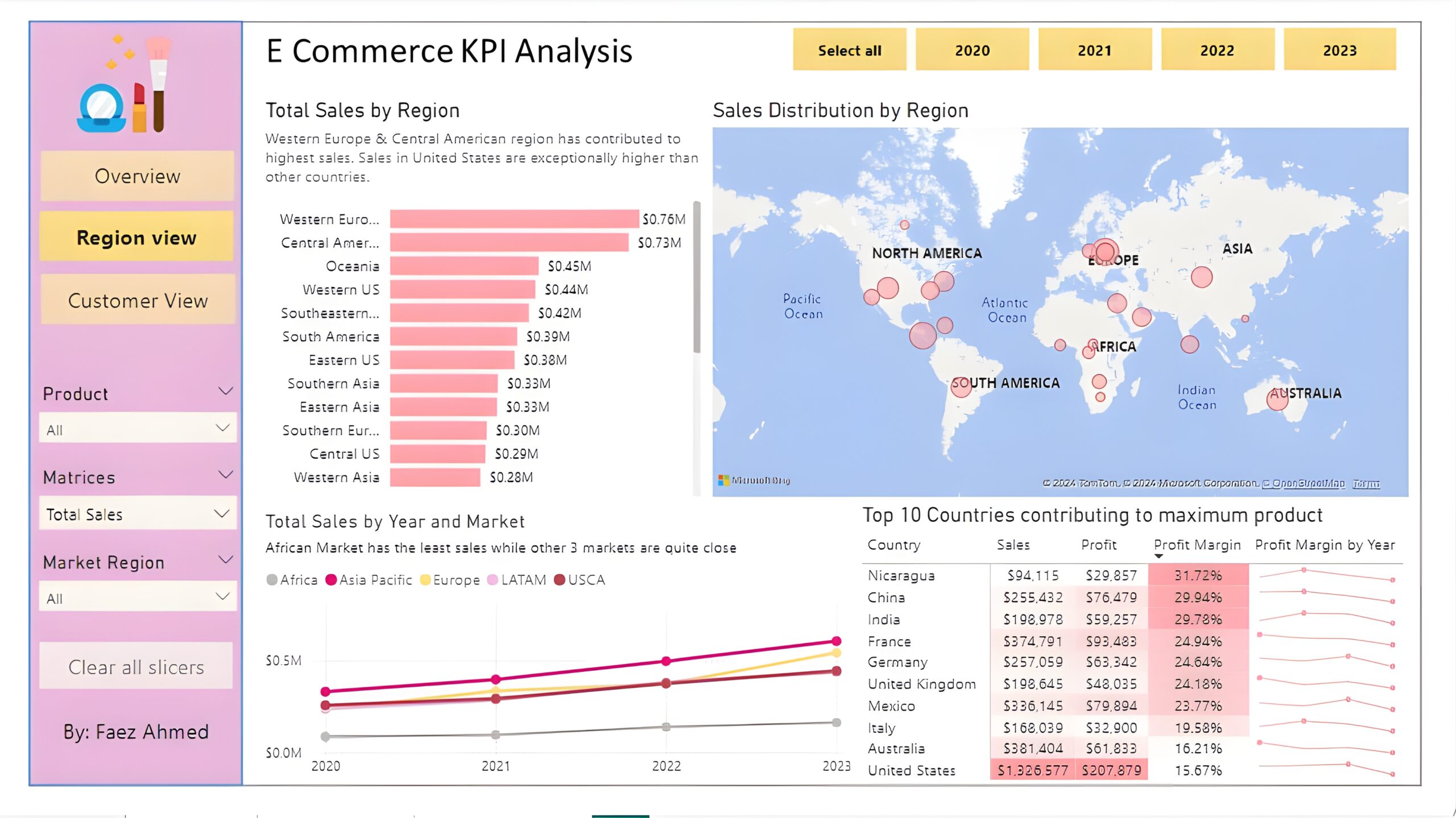
Region View: The second report page is a regional overview page to further analyze the performance in a specific region. It consists of a clustered bar chart that shows sales by regions, a map chart to display sales distribution by regions, a line chart to visualize yearly sales of markets, and a matrix chart that displays top 10 countries with their sales, profit, profit margin and profit margin by year. This offers insight into sales distribution by region.
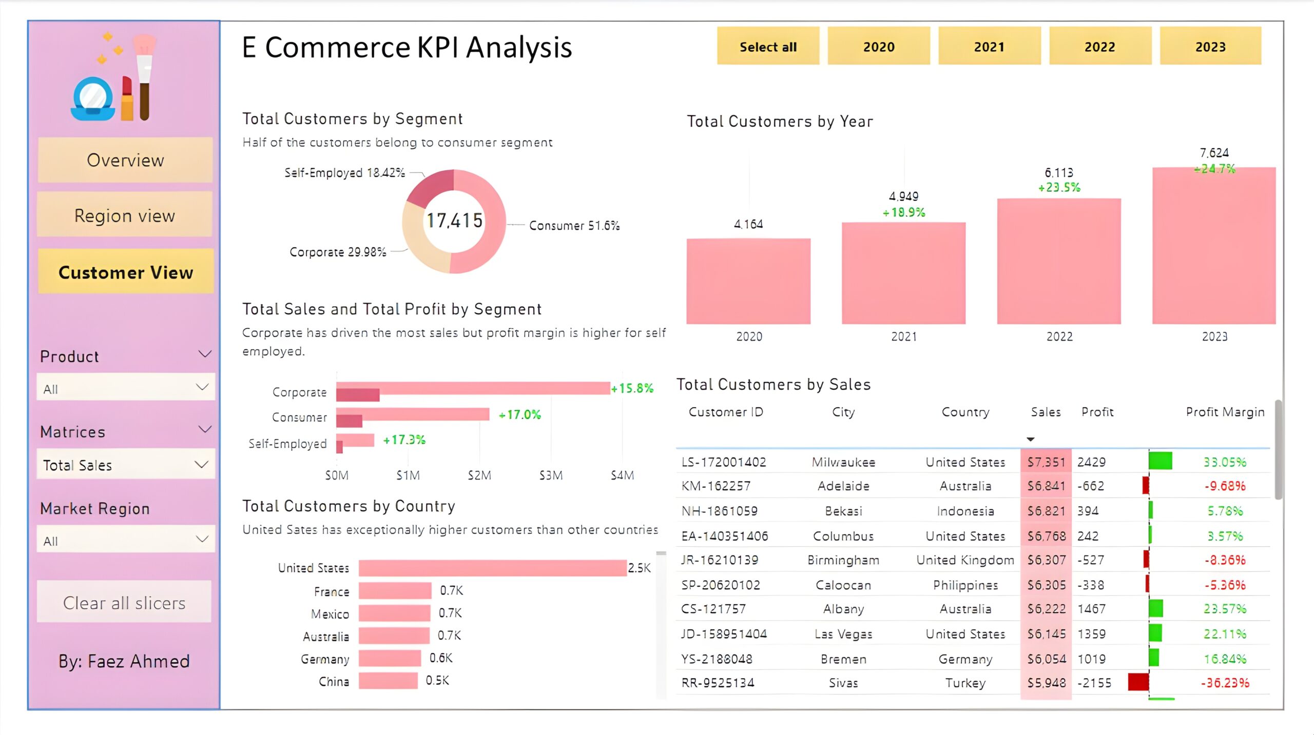
Customer View: The third and final report page provides deeper insight into customer behavior and value. It uses a donut chart to show total customers by segments, a column chart to show total customers by year, a clustered bar chart to display total sales and profit generated by segments, one more bar chart to show total customers by country, and a matrix to present customer’s purchase details, including city and country of order, sales, generated profit and profit margin.
My Resume
Experience Background
Senior Executive Reporting
Mobily & Mobilelink USA (Oct 2022 – Present)
- Conducting daily sales reconciliation, auditing sales and deposit amount.
Prepare a cash and credit card sales audit summary for the leadership and loss
prevention departments.
- Generating detailed reports, such as Sales trend analysis reports,
Fraud transactions report, Samsung sales report (for Employee Rewards), Sales and
Refund velocity report, Zero cash sales report, Invalid discounts report, Employee
commission deduction summary.
- Prepare the expected company’s commission from AT&T and the actual commission
report that we received from AT&T.
- Resolve queries from the AT&T and sales teams via emails on a daily basis.
Field Sales Manager
Premier Sales Pvt Ltd (Jun 2022 – Oct 2022)
- Looking after the account of Highnoon Pharma around 80 million plus per month.
- Looking after 3 branches in Karachi, and 3 Sales supervisors direct reporting to me
and around 30 indirect reporting of “Order Bookers”.
- Reporting to the Zonal Manager of Sales & Operations South Region, and assisting
to identify and execute improvements to sales effectiveness, processes, and
strategy.
- Regular coordination and follow-ups about sales value with existing Team and
ensure KPI's.
- Responsible for meeting goals and objectives by working closely with existing
channels and developing new channels to market.
- Responsible for developing, maintaining, and updating all sales & distribution
related reports to higher management and for achieving monthly sales targets.
- Prepares and summarizes sales analysis to identify key trends and identify
opportunities to maximize sales force effectiveness.
Regional Manager
Searle Co. Ltd (Pharmaceuticals Company) (Nov 2017 – Jan 2022)
- Manage all the members of sales team for the assigned region, define the work
plan and assign duties to each individual accordingly to their scope and assigned
products.
- Continuous coordination with team members and with the distributor for timely
placement of orders and to promote the company's products in the assigned
territory with listed clients.
- Successfully manage the coordination and relationship with clients as company
representative in assigned territories to maintain client satisfaction and future
sales perspectives.
- Create weekly and monthly progress reports and presentations for the
management to project the quarterly targets.
- Arrange appointments with doctors and specialist consultants to make them
aware of the company products.
- Arranged CMEs and RTDs with the goal to increase product promotion and sale
growth
Business Development Executive
RJ Real Estate (Dec 2015 – Oct 2017)
- Dealing with walk-in / registered clients and conducting research and analysis
profitability of the property market to determine areas with increasing demand.
- Responsible for advertisements of available properties on different newspapers
and social media to promote the business and maintain a database of residential,
and commercial properties in the market.
- Sending out details of new properties on the market to people on our database.
- Making appointments and showing buyers around a property.
- Finding buyers in a position to proceed with purchase and willing to pay an
acceptable price
Education Background
Master's of Business Administration (MBA - Marketing & Strategic Management)
Dadabhoy Institute of Higher Education (2021)
Bachelor's Degree of Commerce (B. COM)
Dadabhoy Institute of Higher Education (2016)
Soft Skill
Leadership & Strategic Planning
Training and Development
Teamwork and Coordination
Recruiting & Onboarding
Communication & Presentation
Technical Skill
STATISTICS
MICROSOFT EXCEL
POWER BI
STRUCTURED QUERY LANGUAGE SQL
PYTHON
Certifications
Professional Data Analyst Certification Program
Analytix Camp (Jan 2024 – July 2024)
1. Proficient in Excel: Demonstrated ability to manipulate data, perform complex calculations, create pivot tables, and generate insightful visual.
2. Power BI Specialization: Capable of designing interactive dashboards and reports to visualize data trends and patterns, enabling stakeholders to make informed business decisions..
3. Proficient in SQL: Profound understanding of SQL querying language, adept at extracting and manipulating data from relational databases to conduct thorough data analysis and generate meaningful insights.
4. Strong foundation in Statistics: Possess a solid grasp of statistical concepts such as hypothesis testing, regression analysis, and probability theory, enabling accurate interpretation of data and formulation of data-driven recommendations.
5. Competent in Python: Proficient in utilizing Python programming language for data manipulation, analysis, and visualization tasks, leveraging libraries such as Pandas, NumPy, and Matplotlib to derive actionable insights from diverse datasets.
6. Comprehensive understanding of Data Analysis Methodologies: Equipped with a holistic understanding of various data analysis techniques and methodologies, including exploratory data analysis (EDA), and regression analysis, to extract actionable insights and drive business growth.
7. Effective Communication and Presentation Skills: Able to effectively communicate complex analytical findings to diverse stakeholders through clear and concise reports, presentations, and visualizations, facilitating informed decision-making processes across organizational levels.
Testimonial

Muhammad Abbas
Chief Executive OfficerPower BI Project Development
via Fiverr - Mar 30, 2024 - Apr 30, 2024I am pleased to commend Syed Faez Ahmed for their outstanding dedication and achievements. They consistently exhibit a strong work ethic and enthusiasm for learning, contributing positively to our academic environment. Their willingness to take on challenges and their commitment to excellence are truly commendable. Syed Faez Ahmed is not only a high achiever academically but also a supportive and collaborative member of our community. Their accomplishments serve as an inspiration to their peers and reflect their potential for continued success in the future.
Contact With Me


